Posts Tagged ‘architecture’

best of the best

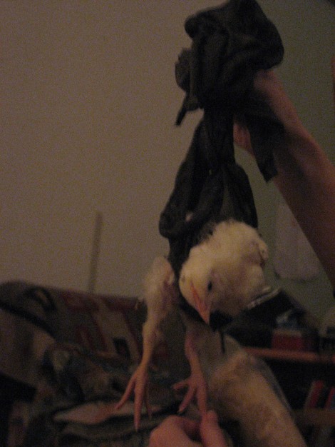
People keep asking me about my trip, so I thought I would post some photos.  I mean, it’s hard to describe chicken pants…it’s something you just have to see for yourself.

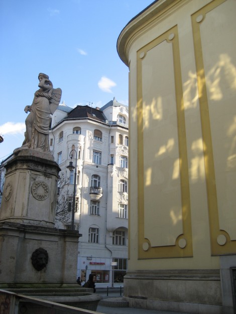
a typical beutiful day in Budapest, gorgeous statuary and all...

strangely, wearing chicken pants and being hoisted in the air was very soothing to these little gals

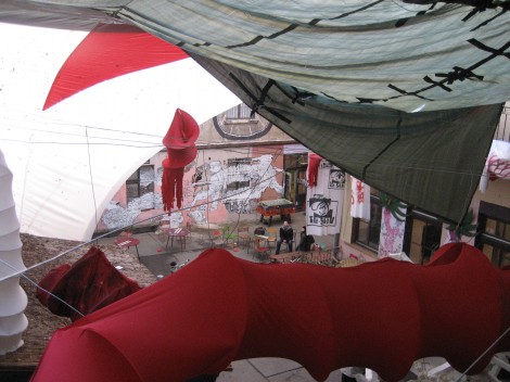
a sweet courtyard in an atists' complex

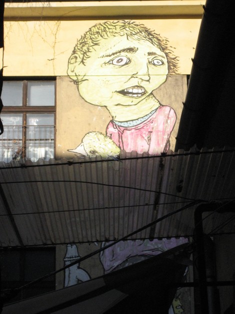
the courtyard has some pretty wonderful murals on the walls

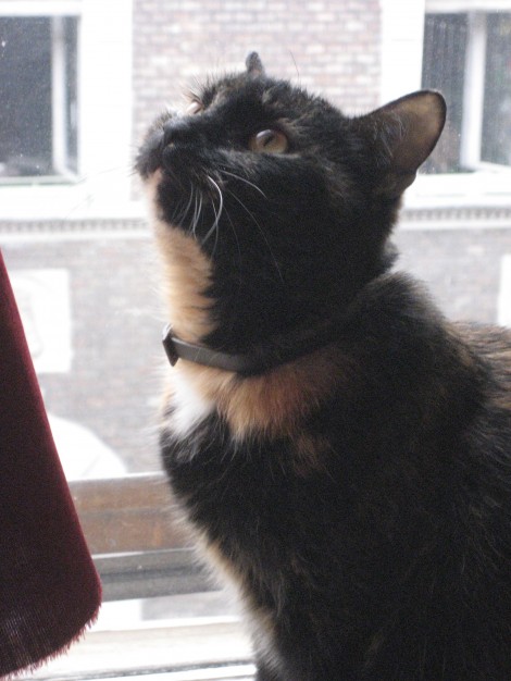
Mitsy the Hungarian forest cat, friend to human and chickens alike

Nannette in our "office"

Nem nem... what???

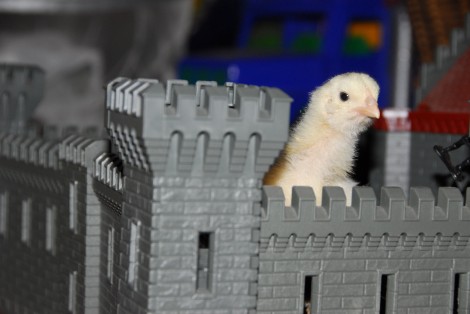
chickens are inside the castle walls! (when I give Nannette my jump drive to transfer video stuff, it comes back with some extra little gifts- like this photo)

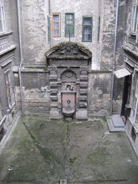
the courtyard at David's studio

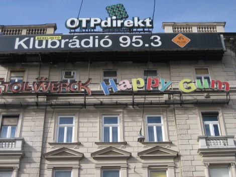
Happy Gum

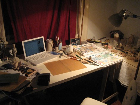
my little studio corner with David's mini statue park

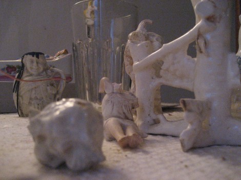
a close-up of the statue park

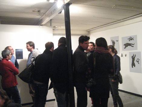
opening night

crystals in the public eye

So, I don’t really follow the Olympics…and I don’t own a TV, (I know, I know…how unAmerican, right?) so I didn’t get a chance to see images from the opening ceremonies until they popped up on a TV in a pub I went to last week.  I saw this large crystal structure all aflame, and was simultaneously pleased to see such a brash display of awesomeness, and disappointed that this object I have seen cropping up in art and design the last couple of years was used for such a commercial event.  For a recent, relevant example, see the work of Alexis Anne Mackenzie in the previous post or this post from awhile back.

What’s funny, is that in all of the googling I did to find images for this post, not once did I see the word “crystal” appear.  Cauldron?  yes.  The ever-vague “structure”? yes.  Pillars? yes.  Also, I couldn’t find the name of an architect or designer for the “structure.”  It was simply implemented by the Vancouver Organizing Committee for the 2010 Olympic and Paralympic Winter Games (VANOC).  So, as much as I would like to give credit to some savvy designer with her finger on the pulse of the art world, I can’t.  Instead, I am left feeling a little bit like a somewhat ubiquitous, but relevant image was exploited by a behemoth of an event, and as a result, I feel a little bit empty inside.  Oh, Canada.

showin’

It’s a busy, busy week of show preparation in the ol’ studio.  The work for the next Gallery Project exhibition is due Sunday.  Yikes!  Details coming soon to their website.

2010-pahpostcard

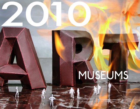
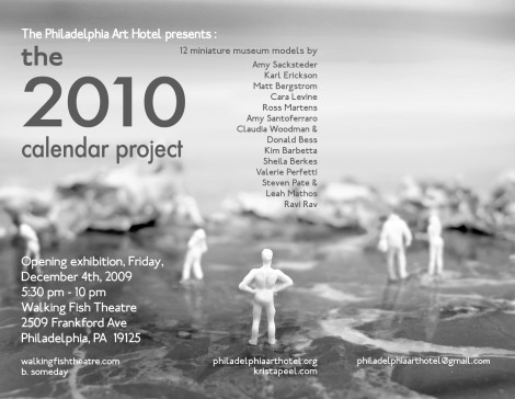
Also, if you happen to find yourself in the Philly area, you can attend the reception for the 2010 Calendar: MUSEUMS, Krista Peel’s latest venture that features a piece from yours truly.  The calendar would make a great Christmas gift.  Check it out.

2010-pahpostcardback

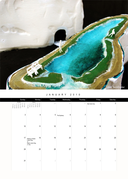
My calendar page.  Looks like I’m back to Ms. January!  I can’t believe I have been in these awesome calendars of KP’s since 2004!  What an honor!

I'm Ms. January once again!

*ta da!*

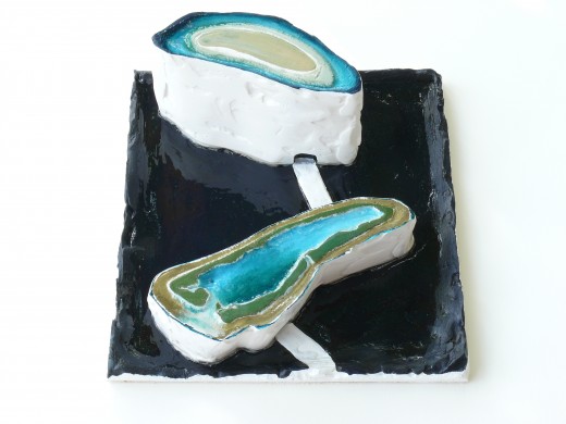
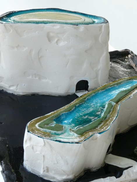
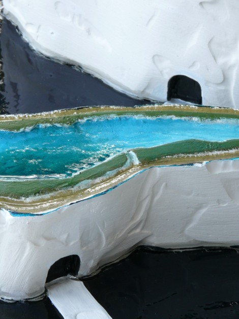
So, after a long wait, with much suspense, I present to you the islands.  They are supposed to be mini art museums, thus the walkways and little doors.  My friend and fellow artist Krista Peel has challenged me and a two handfuls of other artists to come up with mini art museums for her latest calendar project.  She will harness her mad skills to photograph these little buildings with railroad people milling about them and assign them to a particular month in a glossy, glorious calendar.  My particular take on the challenge was obviously influenced by my recent work drawing and painting the islands.  mini art museumcloser look

even closer

So though I always have fun making work for KP’s calendar projects (wow!  since 2004 now), they always reaffirm for me how much I love painting and drawing as opposed to working with 3D-oriented media, as in this case with pink insulation foam and plaster.  I had much more fun painting the surface of the islands than I did doing all of that sanding.  Still, it’s nice to be able to expand into whatever realm is presented and I am pretty happy with the final result which isn’t too far off than what I has envisioned in my drawing.  Plus, as I mentioned before, this was my first foray into model railroad land.  It’s quite a place!

There are a lot of artists out there doing this model railroad thing, and other work with miniatures.  I must say, in the following cases (and with Krista Peel’s work, which is, of course, a given), I am quite taken with it:

Thomas Doyle makes strange little events happen in snow globes.

Courier, mixed media, 12.5 x 14, inches diameter, 2007

Courier, mixed media, 12.5 x 14, inches diameter, 2007

Acceptable losses, mixed media, 16 x 13.5 inches, diameter 2008

Acceptable losses, mixed media, 16 x 13.5 inches, diameter 2008

Though these following images by Walter Martin and Paloma Muñoz are c-prints, they are clearly taken using diorama-like sets.  Is it any coincidence that the title of this series is “Islands”?

Walter Martin and Paloma Muñoz A Winter Walk, 2006  C-Print 39 x 65 inches

A Winter Walk, 2006 C-Print 39 x 65 inches

Walter Martin and Paloma Muñoz Low Tide, 2008  C-Print 50 x 40 inches

Low Tide, 2008 C-Print 50 x 40 inches

Thanks to my friend Abigail for alerting me to these artists in her blog.  Let me know if you come across others…

crystalskullmirrors

I have been noticing a lot of crystals, skulls and mirrors in art and design in the last few years.  It appears to be a “thing.”  I readily embrace this “thing” and have even busted out a skull or three in my recent work.  There’s a very The Dark Crystal / The Never Ending Story aesthetic to a lot of this work which can probably be explained by the fact that many of the artists embracing it are of the generation that likely grew up with those movies and other like films, books, programs (media in general)  ingrained into our consciousness.

While some incidents of crystalskullmirror I’m seeing are mediocre (one can apparently make abominably cliché work with mirrors, for example) I find myself gravitating toward a lot of this work.  If this post makes it seem like I am lumping artists using these motifs into the same aesthetic category, then please take a look at some of my favorite folks in this realm and judge for yourself.

I am a huge fan of the work of Will Yackulic.  He shows with two galleries I really like: Jeff Bailey in New York and Gregory Lind in San Francisco.  He uses ink and gouache (two media I like to work with) and, somehow, a typewriter to make these stunning two-dimensional otherworlds.

Bearings & Ballast, 2009, ink, gouache and typewriter on paper, 30 x 22.25

Bearings & Ballast, 2009, ink, gouache and typewriter on paper, 30" x 22.25"
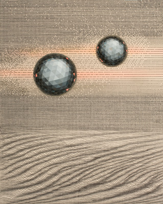
Aspects & Allowances, 2008 ink, gouache, watercolor and typewriter on paper, 22 x 17.75 inches

Aspects & Allowances, 2008 ink, gouache, watercolor and typewriter on paper, 22 x 17.75 inches

Invocation 5th, 2008, gouache, watercolor and typewriter on paper, 10.625 x 8.5

Invocation 5th, 2008, gouache, watercolor and typewriter on paper, 10.625" x 8.5"

Then there’s the work of David Altmejd, whose work Mark and I first came across in the 2007 Venice Biennale, where he put together a fantastic, nay, phenomenal exhibition for the Canadian pavilion.  He uses mirrors A  LOT, but SO much better than anyone else out there using mirrors to do similar things.  They are just one aspect of the insane worlds he creates, which also include:  taxidermied birds,*  giants, genitals, both flora and fauna, fur, body parts, and YOU because there are so many mirrors in his work, that you inevitably become part of the work.  I could barely photograph it without getting myself in a shot.  Like this:
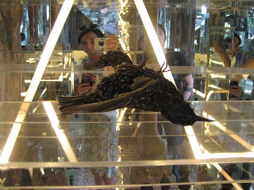
The Index, exhibition at the Canadian pavilion

The Index, exhibition at the Canadian pavilion

Note please that I am not a professional photographer and that there are way sweeter images of his work online.  See? But I thought it would be neat to post some photos I took while experiencing the exhibition.
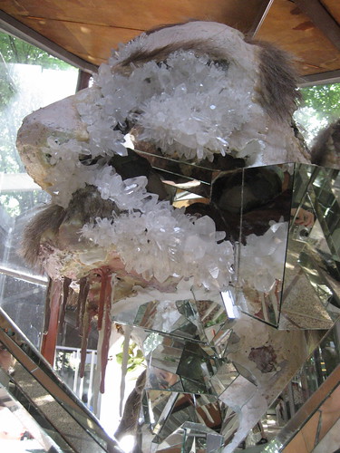
The Index, exhibition at the Canadian pavilion
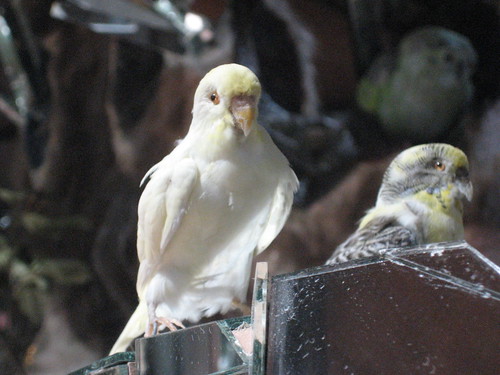
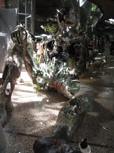
The Index, exhibition at the Canadian pavilion

a mirrored giant monster with Lee Press-On Nails (TM)

a mirrored giant monster with Lee Press-On Nails (TM)

We like him so much, in fact, that we just ordered two monographs on him.  One is the catalog for this exhibition, and the other is this lovely book:
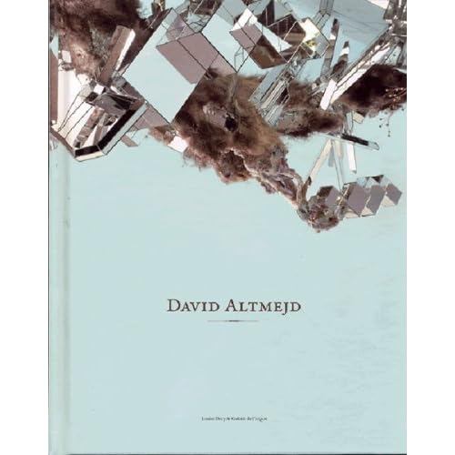
For example of this crystal mirror phenomenon in contemporary media, someone caught indie pop lady Mirah fiddling with these mirror pyramids and put the photo in the liner notes of her latest album.

a(spera)

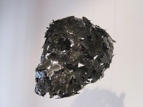
Skulls.  Lots of skulls.  When in Europe, whenever I saw a skull in contemporary art, I photographed it.  Here are the results of my self-assigned scavenger hunt:
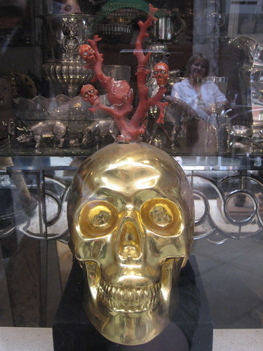
skull in a gallery window in Venice (as a bonus, it even has a skull tree growing from it)
skull in a gallery window in Venice (as a bonus, it even has a skull tree growing from it)

butterfly skull in a gallery in Venice
butterfly skull in a gallery in Venice

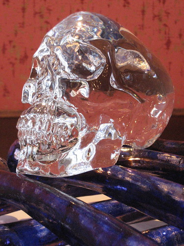
glass skull on glass bones by Jan Fabre at the exhibition Glasstress in Venice
glass skull on glass bones by Jan Fabre at the exhibition Glasstress in Venice

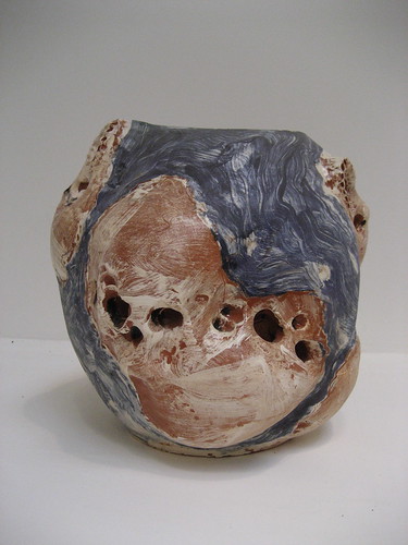
ceramic vessel by Miquel Barceló, representing the Venice pavilion at the Biennale

ceramic vessel by Miquel Barceló, representing the Spanish pavilion at the Biennale
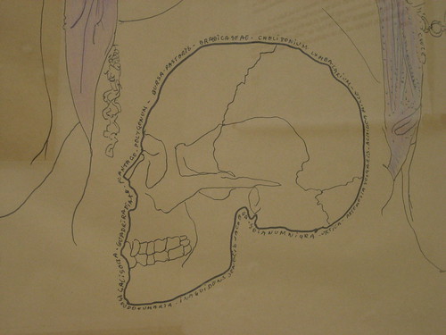
skull in a drawing by Jef Geys, representing the Belgian pavilion

skull in a drawing by Jef Geys, representing the Belgian pavilion

And now, my own contribution:
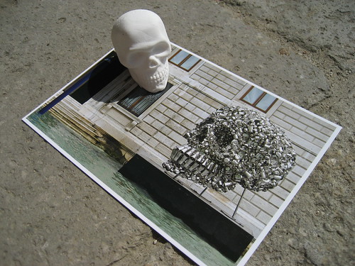
still life I composed out of a postcard and an eraser from the Pinault Collection gift shop

still life I composed out of a postcard and an eraser from the Pinault Collection gift shop

I am so enamored of people’s fascination with skulls (just go on The Selby and see how many skulls you can count in people’s homes alone), that I was making portraits of skulls in Budapest, remember? I’ll get back to those soon I think.

That reminds me, I need to get amakin’, as I am yet again a contributing artist to my friend Krista Peel‘s Calendar Project.  This time the theme is Art Museum, for which I have to create a mini model of a museum.  It can be ANYTHING I want it to be, can be made of any material, and, (blessedly) does not have to be in the least functional.  So, which will it be: Crystals, Skulls, or Mirrors?  I suppose we’ll see…

* Taxidermy is another “thing” in art right now altogether.  Perhaps I’ll tackle that stuffed, lifeless beast in a future post.
I call it “3 + 3”– first go, Rome!

After having just spent a month and a half in Europe, I have spent a lot of time since my return (about 2.5 weeks) reliving and retelling my experiences there.  Within three weeks, Mark and I visited five cities in three countries.  I have finally uploaded all travel photos to my flickr page, but I want to blog about the trip a bit too.  Of course I have already concentrated heavily on my three weeks at the residency in Budapest, but now it’s time to explore the rest of the trip leading up to that.

So, since our purpose in going to Europe was to see and experience artwork, in each of the next few entries which will correspond to the cities we visited in order, I will post three photos of art that is somehow noteworthy in it’s own right (at least as I see it) and three of my own “artful” photos- perhaps of artwork or anything, really.

Here goes round 1- first stop: Rome!

Let’s start with three notable artworks or experiences with art:

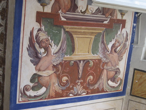
It started with a visit to the Vatican Museum and extended throughout our time in Europe: my infatuation with Italian Grotesque painting.  I love that sur-realism existed prior to Surrealism.

Again at the Vatican Museum (one of the few museums we visited that allows photographs) is the Room of the Animals.  These two gallery rooms contain carved stone statues of every type of animal imaginable.  They reflect the age-old obsession with conquering and collecting animals to form a sort of menagerie.  A private garden full of exotic animals was a sign of wealth.  An excellent book on the larger subject is called Dominance and Affection: The Making of Pets by Yi-Fu Tuan.

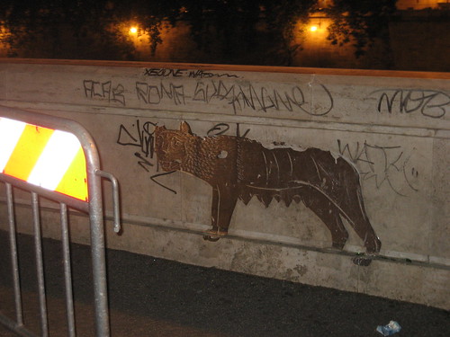
Foil she-wolves placed on the walls that line the Tiber, a public art-installation by Kristin Jones.  Here’s one that was close enough for us to see in detail, but hundreds of them  line the wall that recedes downward from the upper walkways on both sides of the river for a stretch.  The way they reflect the city’s lights at night is a mystical spectacle.  I like this photo because it captures the reason for Jones’ embarking on the project in the first place: neglect.  The barricade, graffiti and litter form an environment against which this momma wolf  snarls and bristles as she protects her young–human and wolf alike.  Here’s a New Yorker article on how this project came about.

Okay, now for my three “artful” photos, whatever that means.  They might be photos of or containing someone else’s artwork, or they might just be a shot by me that I think turned out particularly well.

Palm trees against the bluey blue of a sky nearing dusk.  Taken on our first night in Rome.

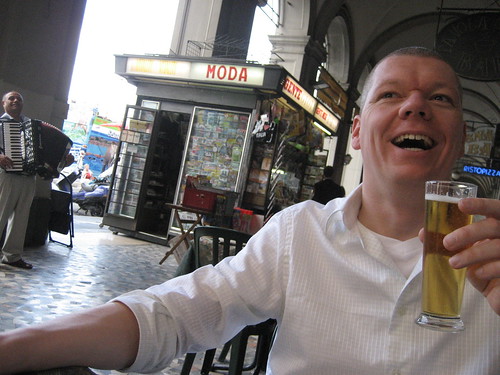
We were fortunate to travel with our friends Mary and Chris for the Rome-Florence-Venice portion of our trip.  We had traveled with them to Toronto, CA and London, UK on separate trips in the past, and when we started to hatch this trip to Europe around my residency and the Venice Biennale, it coincided with vacation plans they were making for the summer.  Here is an amazing photo of Chris having a great time at a cafe that we joked would be perfect in a travel guide.  We really were having a good time, but this photo is almost hyperbolic in it’s quintessential just-kicking-back-in-Rome-ness, complete with the token accordion player.

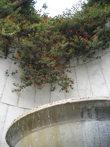
I was able to momentarily stop time at a fountain near the Coliseum.

Next stop: Florence!

away…

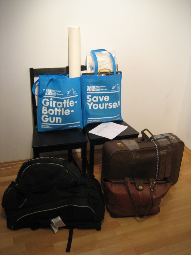
I am packed and ready to go.  I can’t believe I got all of that stuff into two suitcases and three carry-ons.

save yourself

save yourself

I have been busy wrapping things up here.  By some miracle I was able to make my video camera work long enough to put all of the footage from shoot #1 on my computer.  Now Nannette and I can continue to work on the video remotely.

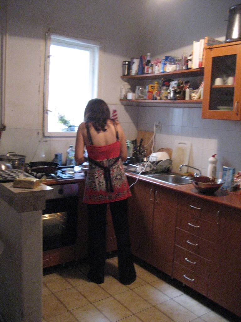
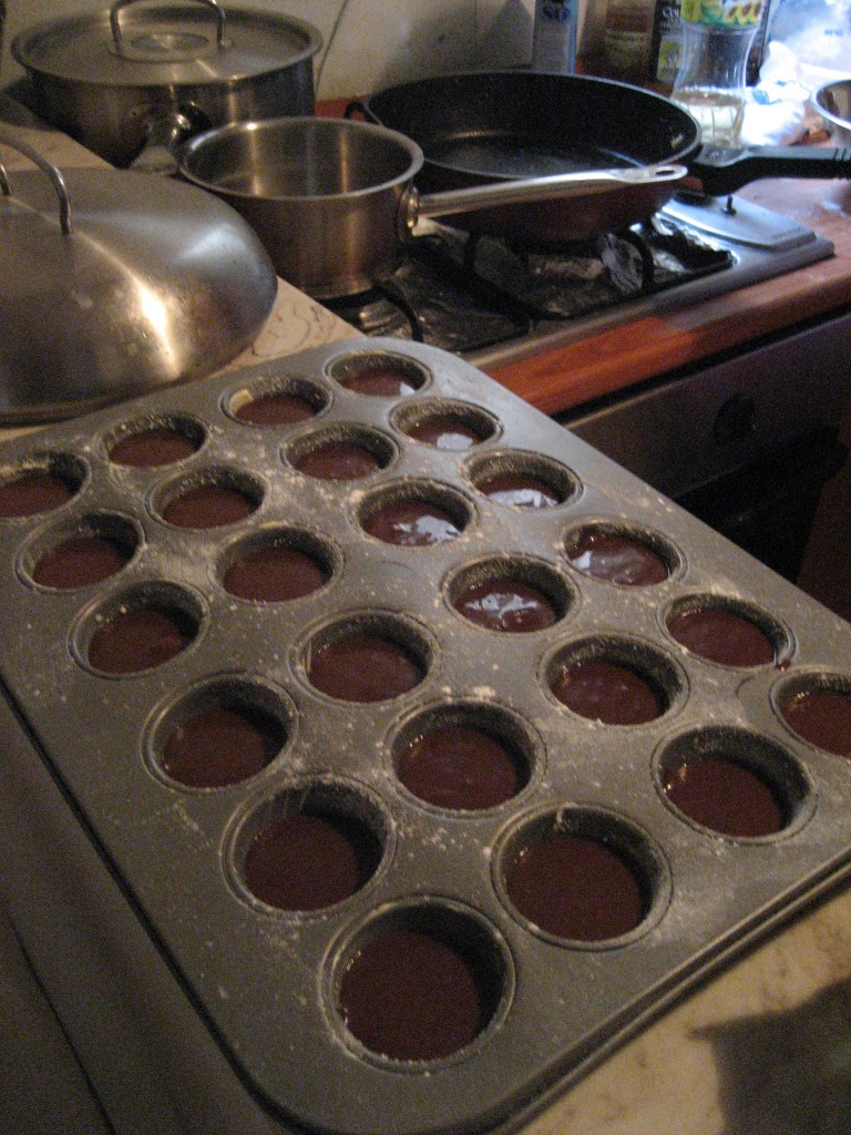
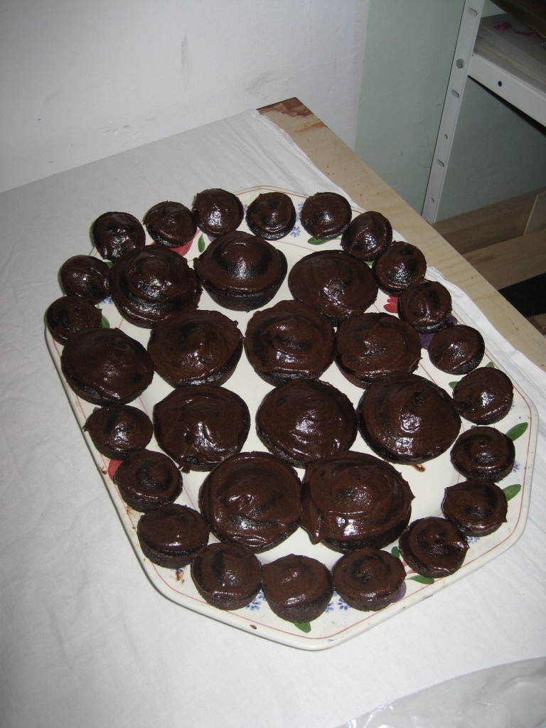
Yesterday she and I made vegan chocolate cupcakes to bring to the sending off soiree hosted by David last night.

IMG_6417

wee tiny cupcakes!

wee tiny cupcakes!

IMG_6420

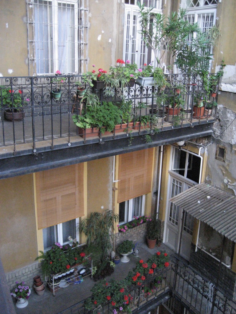
David's lovely apartment building

David’s lovely apartment building

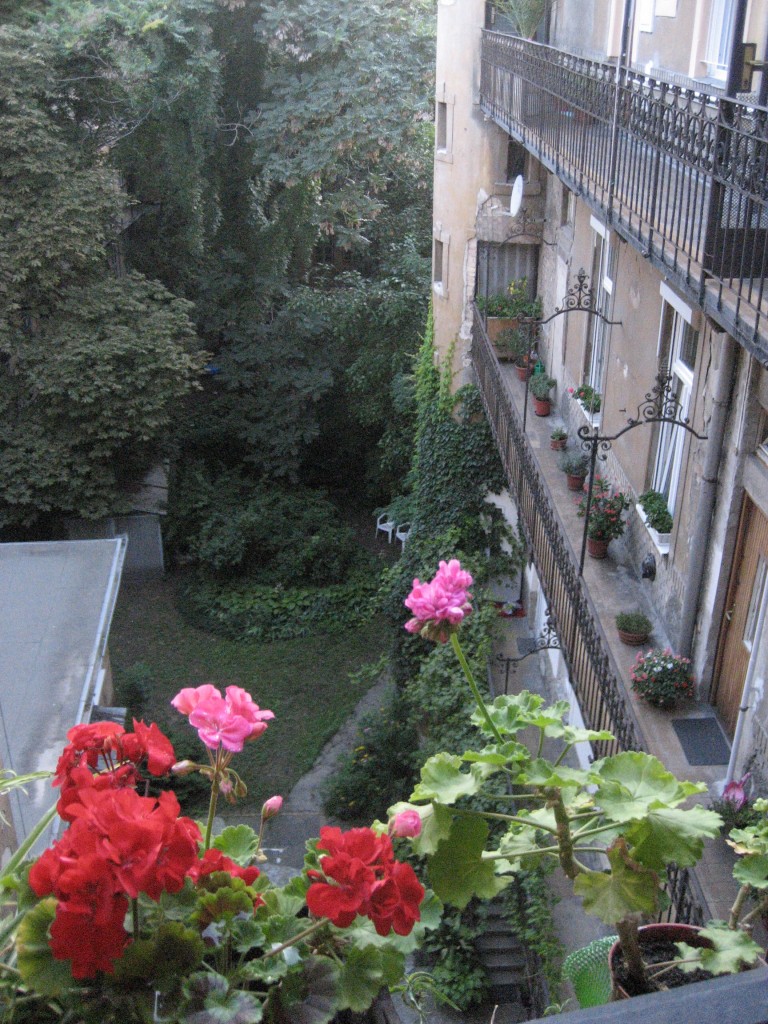
the view from his terrace

the view from his terrace

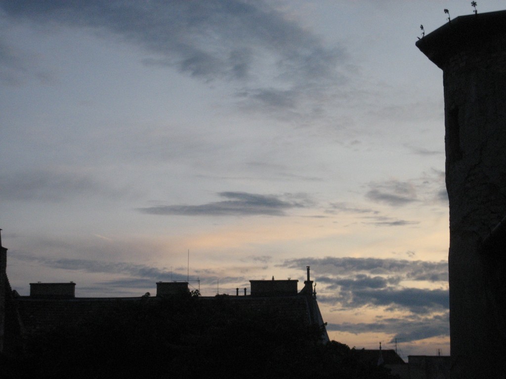
the sky was lovely last night

the sky was lovely last night

IMG_6466I’ve really enjoyed my time here and hope to make it back at some point.  I’ll miss all of the wonderful people I’ve met here.  Szia!  Hello!

looking up

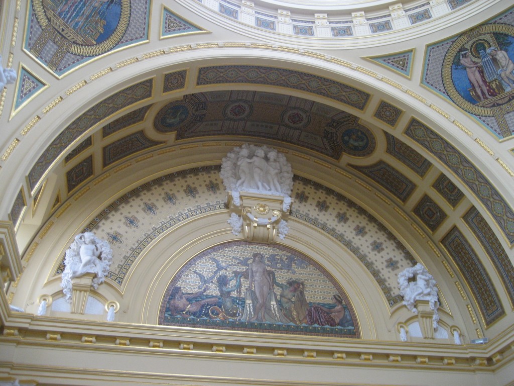
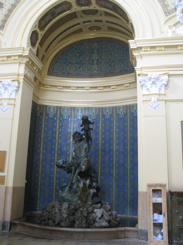
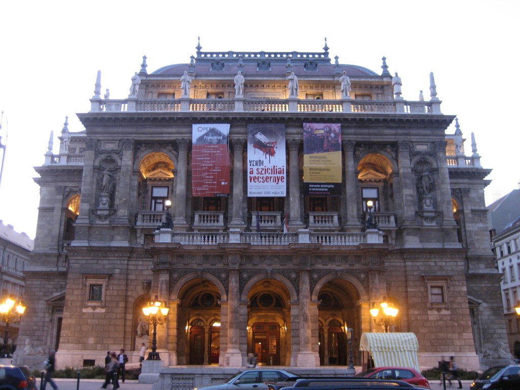
I was recently told: when walking around in Budapest, instead of looking down, be sure to look up for all of the beauty that can be found above you. I am paraphrasing, but that was the general gist.  The architecture, statuary, and ornamentation here is amazing and thankfully survived a lot of the wars and bombing that befell other European cities.

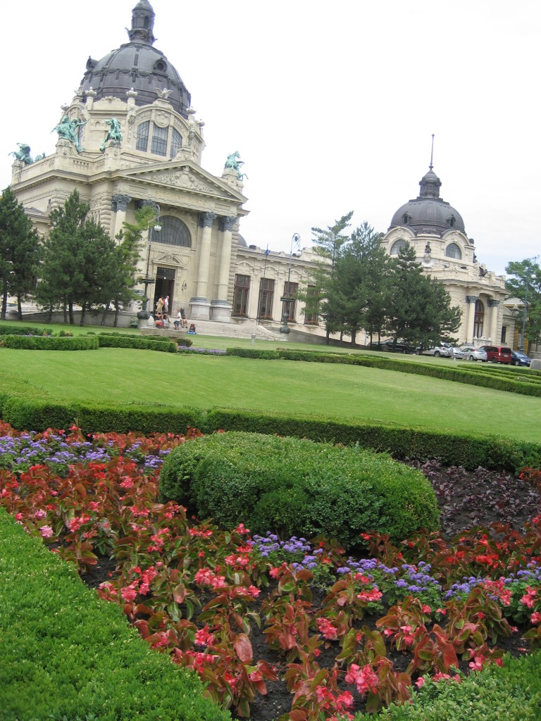
Széchenyi Baths

Széchenyi Baths

 just inside the entrance of Széchenyi Baths

just inside the entrance of Széchenyi Baths

 just inside the entrance of Széchenyi Baths

just inside the entrance of Széchenyi Baths

The Opera

The Opera

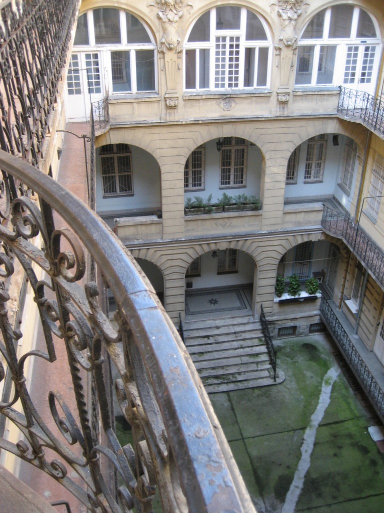
the building in which my and Mark's hostel was situated- these courtyards are very typical in Hungarian buildings

the building in which my and Mark's hostel was situated- these courtyards are very typical in Hungarian buildings

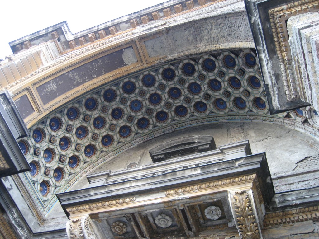
ornamentation on an old building now used as artist studios

ornamentation on an old building now used as artist studios

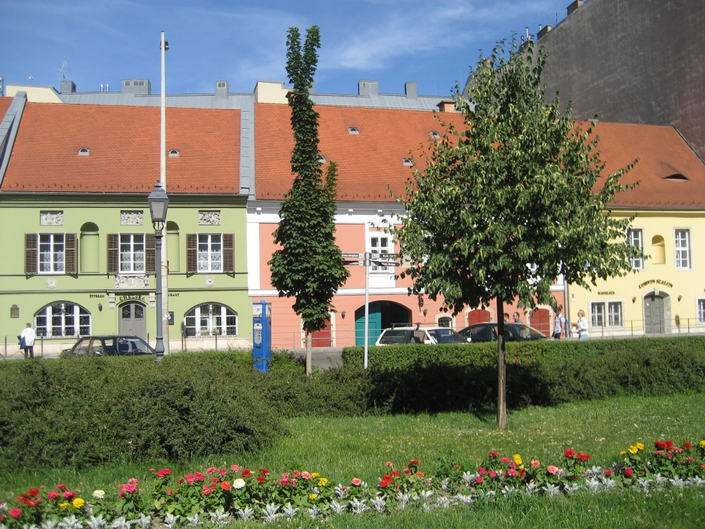
I like the use of color on these shops in Buda

I like the use of color on these shops in Buda

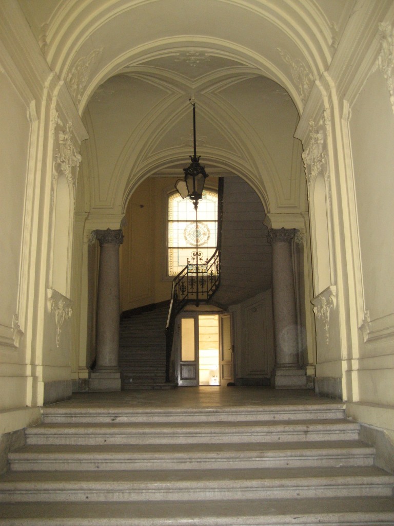
the entrance to the building that houses David's studio (part of it was on loan to Michael and me while here)

the entrance to the building that houses David's studio (part of it was on loan to Michael and me while here)

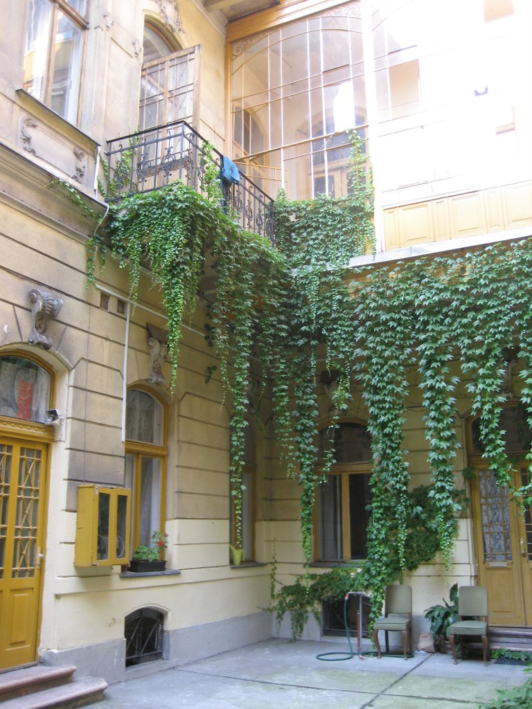
the falling ivy in the courtyard of the studio building

the falling ivy in the courtyard of the studio building

hoot.

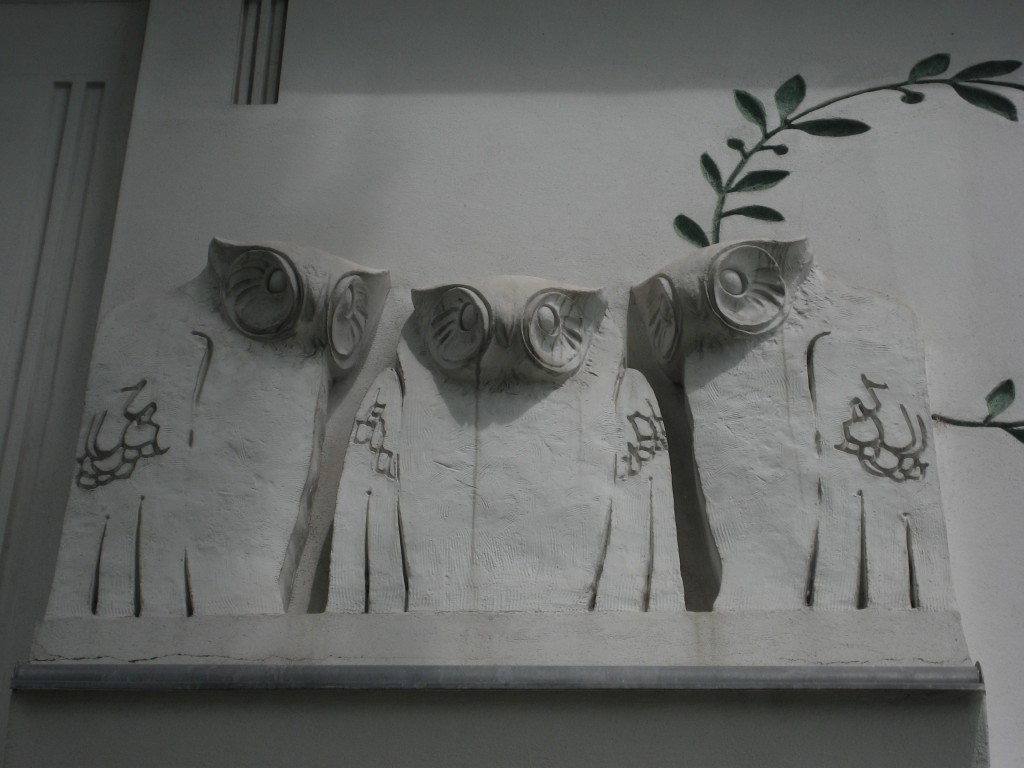
Here is a photo from Vienna for my friend Lauren who loves owls.  Owls + art deco + architecture = very cool.

IMG_5538

It is on the Secession buiding designed after Klimpt.