Posts Tagged ‘DIY’

studio on Design*Sponge
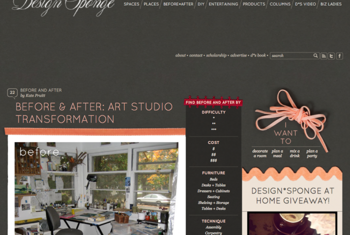
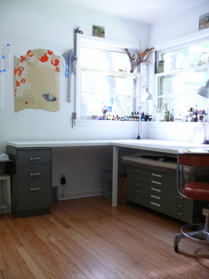
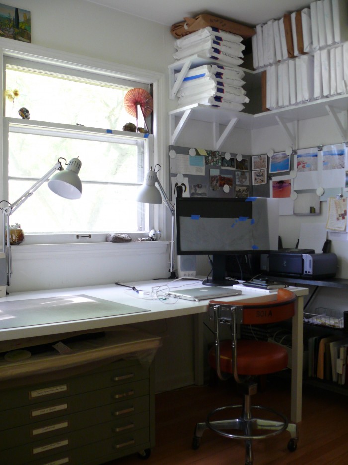
My summer studio transformation was featured on Design*Sponge yesterday. Thanks to people for their kind comments. Some common questions kept arising, so I thought I would address them here and post a few more photos for clarification.

I’m paraphrasing some of the questions and include responses below:

1) I see a bunch of art supplies in the “before” (read: ridiculously messy) image; where did they all go?

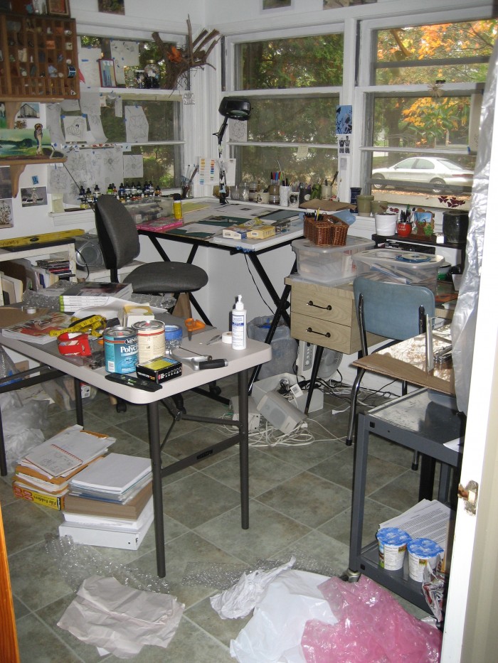
Well, this image was taken awhile ago. It was the only image I had that showed this much of the space from the doorway. I guess I was never happy enough with my studio want to photograph it. I may have hoarding tendencies, but most people who know me know that I am actually a pretty neat and organized person. I probably took this photo because of the remarkably messy state of the studio. As I recall I was framing and shipping a batch of drawings all while completing the mammoth task of my third year document (pre-tenure) document for school (I teach at a local university).

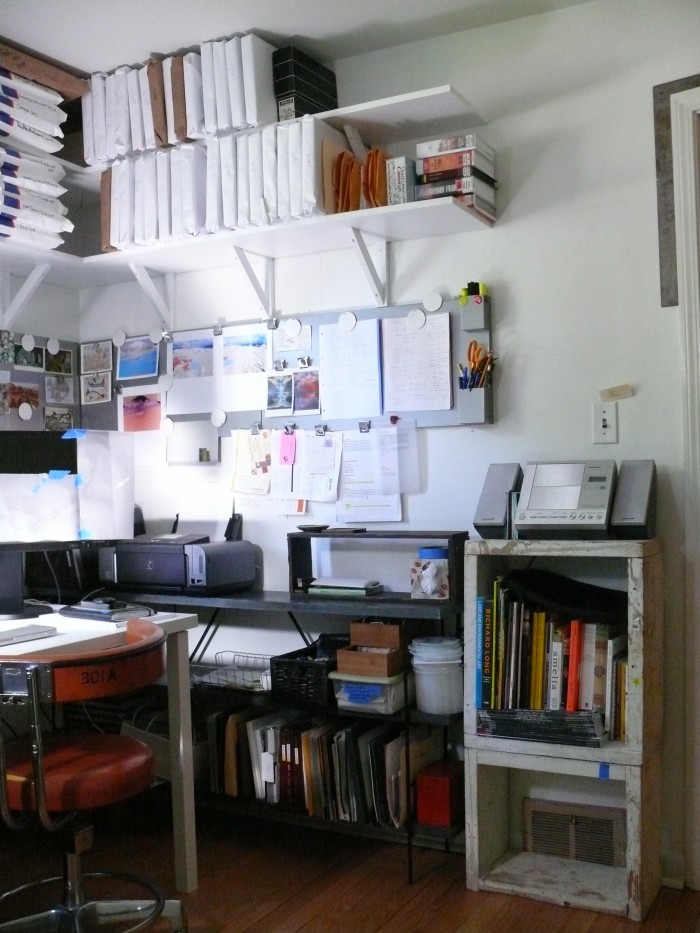
Anyway, here are some images of organization and storage solutions, i.e. where I put a lot of that stuff (the stuff I didn’t haul away, discard, take to the basement, etc.):
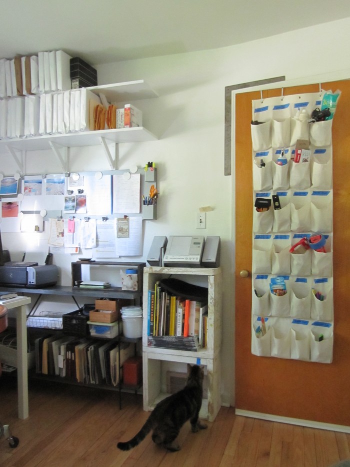
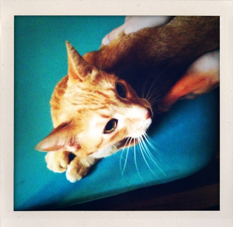
The shelves we built now hold my small framed work and much of my paper work and application supplies are vertically filed on the gray-ish blue shelf under the Ikea magnetic boards. The shoe organizer holds all of my office supplies and other random stuff like my glue gun and glue sticks (all with blue tape labels). That’s Wobbly Bob, one of our cats.
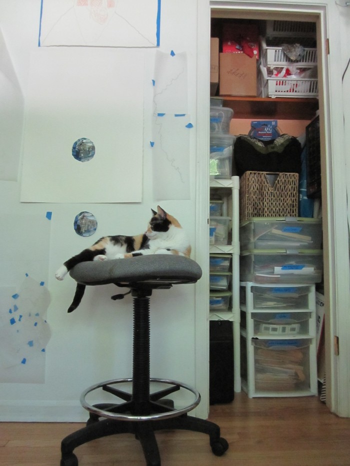
I used the closet to house cans of paint, a wall-mounted drawer system for organizing small hardware, and many labeled plastic crates, totes and drawers for various odds and ends, all categorized. I took off the closet door to have easier access to all of this stuff and to reveal more wall space for hanging work.

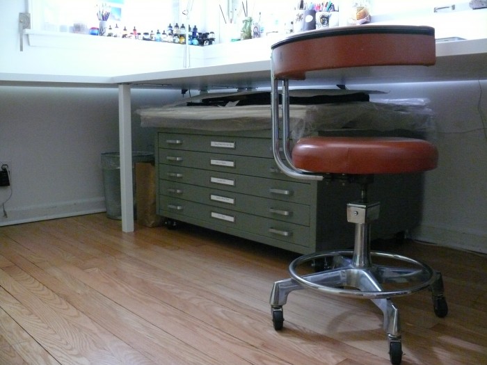
Also, that’s Ramona, and that’s her chair. I can’t take it out of the studio for fear that she would perish of sadness, as it’s her favorite place to be ever. I should mention that I have no personal need for this chair anymore since it’s too tall for my work surfaces. So in my highly efficient new studio, I have a chair just for a cat. At least it keeps her from walking all over my drawings.

2) How in the heck did you do all of that with a 500.00 budget (also where did you get your flat files)?

I put together a budget afterward to see what I had tallied. Here’s how it breaks down:

-Wood/doors–used for the table tops
(Home Depot):                                                115.

-Table legs and brackets x6 (”):                          60.

-Paint: (Benjamin Moore):                                  50.

-Flat file (craigslist):                                         160.

-Small file cabinet (local Re-use center):             10.

-Sandpaper, paint rollers, casters, etc.              100.

About:                                                            500.

We designed our own shelves and supports, but you can find some pretty great pre-made shelves and brackets out there. I first sanded and primed, then sanded and painted the worktable and shelves with Benjamin Moore’s GRAHAM Ceramic Satin Interior water borne enamel in Decorators White. Little foam paint rollers gave the surfaces a pretty smooth finish.

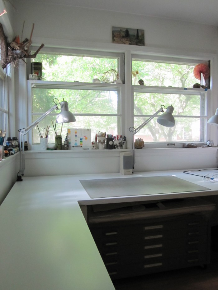
I looked all summer for a flat file on craigslist. I found one that was the right size for my small studio (in the bedroom of our ranch house) for a decent price.  It’s precisely: 40-3/4″ W  x  28-3/8″ D  x  15-3/8″ H. It had to be cleaned up a bit, but serves my purposes perfectly.

3) (From Lauren) Can I have your sweet orange chair when you’re done with it?

Yes. And I probably won’t be. I’ll will it to you though. It’s from the University of Michigan’s very excellent property disposition center–from their dental school I think. It cost about 15 dollars as I recall and badly needs to be reupholstered.

4) It looks too clean now; where did your mess go?

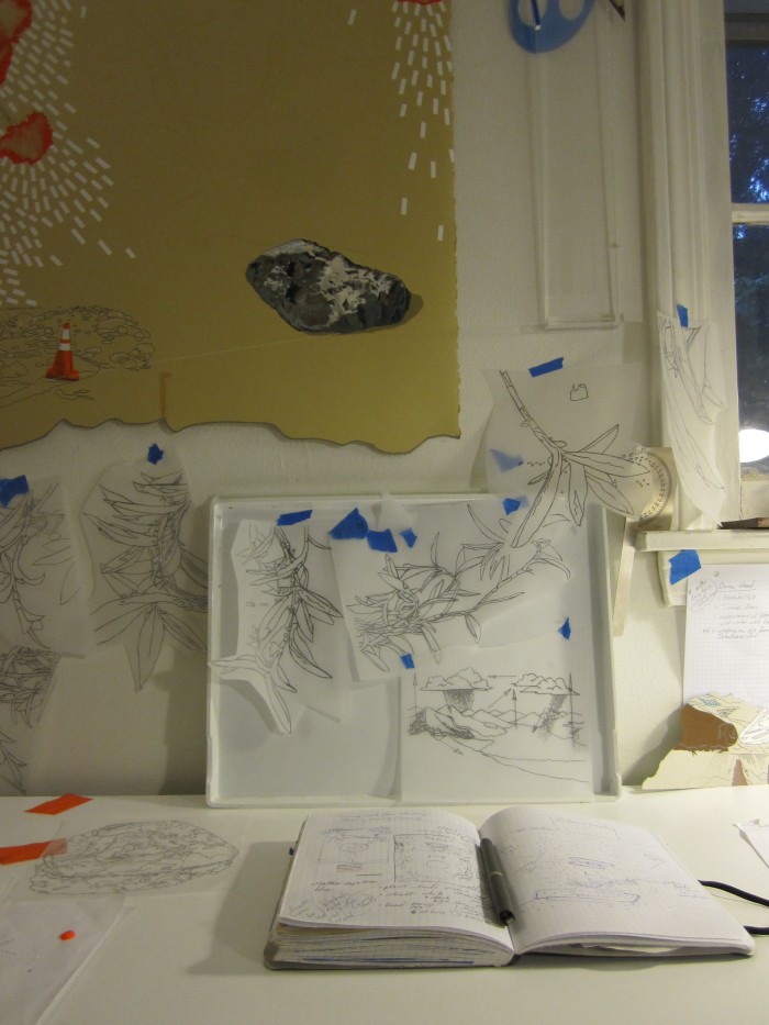
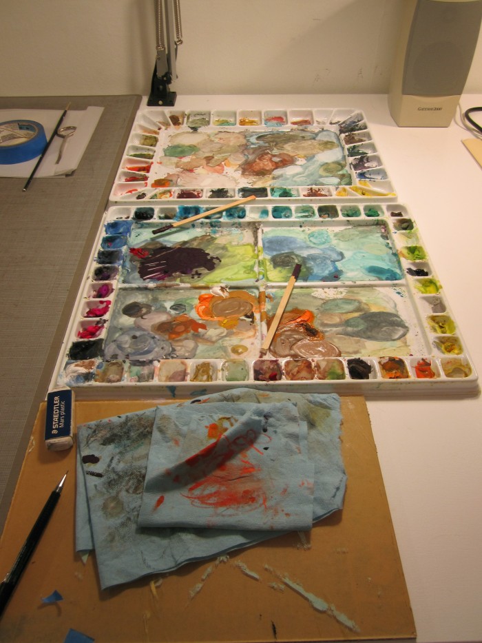
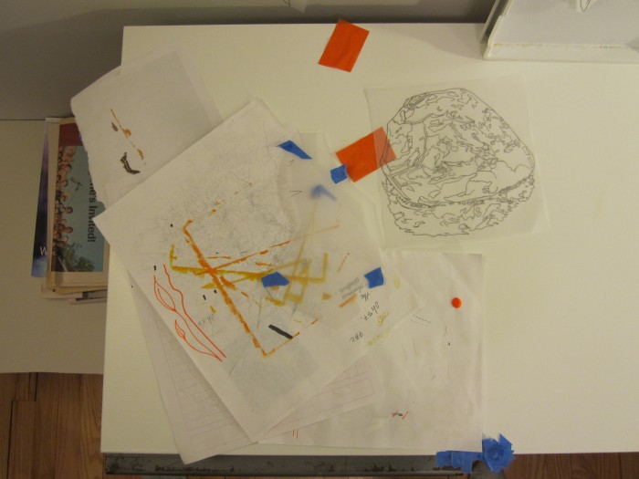
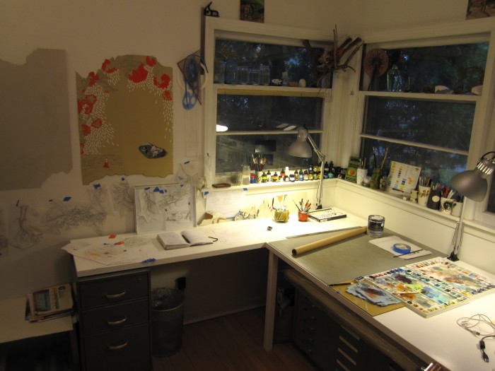
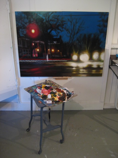
Naturally I took the photos at the completion of the project when everything was shiny and pretty. Now that I have had some time to live in it, there are little scuffs on the tables and my stuff is getting spread out everywhere again. When I want to reign it in between projects though, it’s that much easier now. Here are some images of my slightly more lived-in space with drawings in progress:
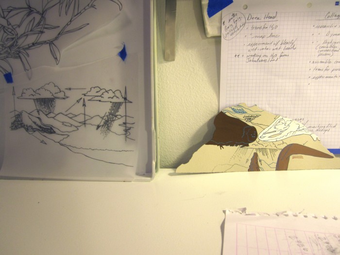
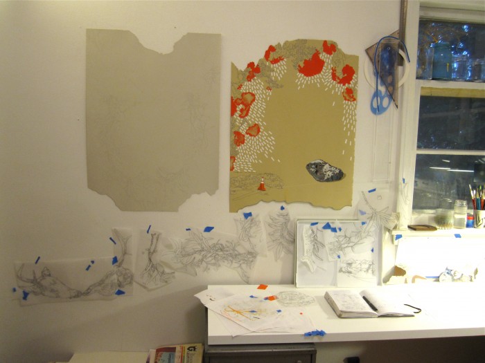
After the craziness of the start of school, having friends in town for labor day weekend and some traveling this weekend to drop off work for a show, I finally get to spend  Tuesday all day long in this space. I can’t wait. I promise to make it even messier.
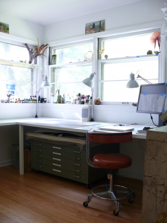
 

it all started with a flat file…

**update**

This studio transformation was recently featured on Design*Sponge. I wrote a follow-up post answering some of the questions that arose in the comments and also posted a few more images here.

With the help of Mark, I spent the entire last month in major house studio overhaul mode. I had five year’s worth of paperstuffs, random art supplies and countless odds and ends to sort and either discard or organize. It all started with my desire for a flat file, since all of my flatwork and papers were sloppily vertically stored against the wall behind a closet door.

The organization project evolved into ditching my drafting table and our old kitchen table I was using as a desk in favor of clean, white tables easily made out of doors and painted white. Mark built me wall shelves for storing small, framed work and we got them installed yesterday. Now the studio feels so much better, I want to be in here all the time. Just to show you how far it’s come, at one point, it had devolved into this:

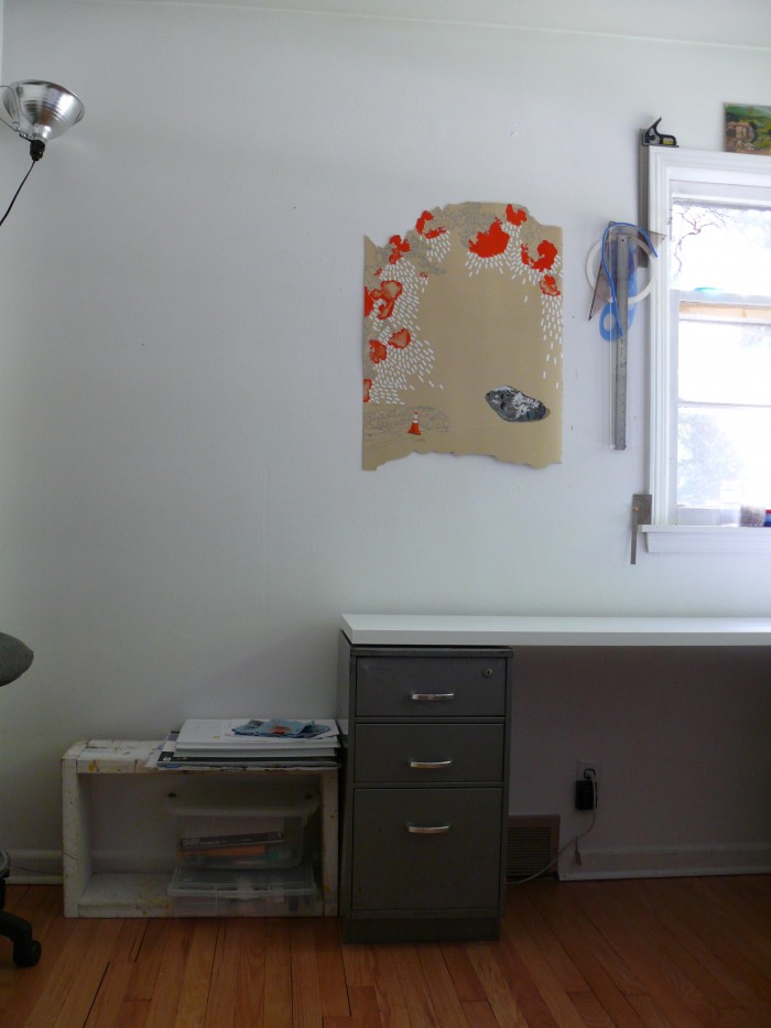
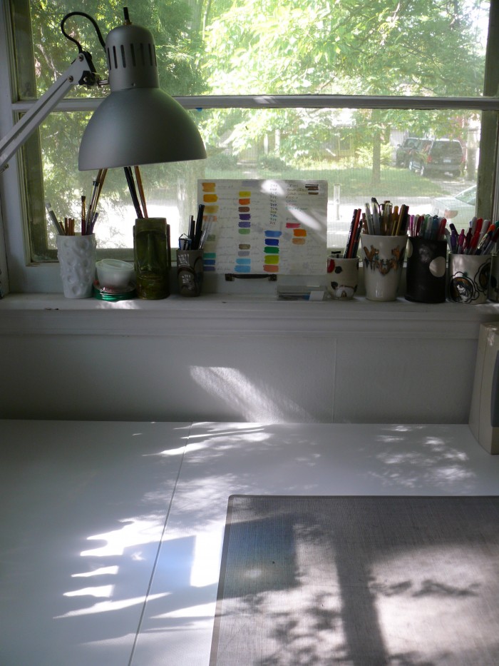
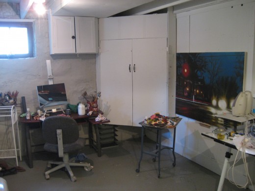
Here are some overview shots of the new setup:

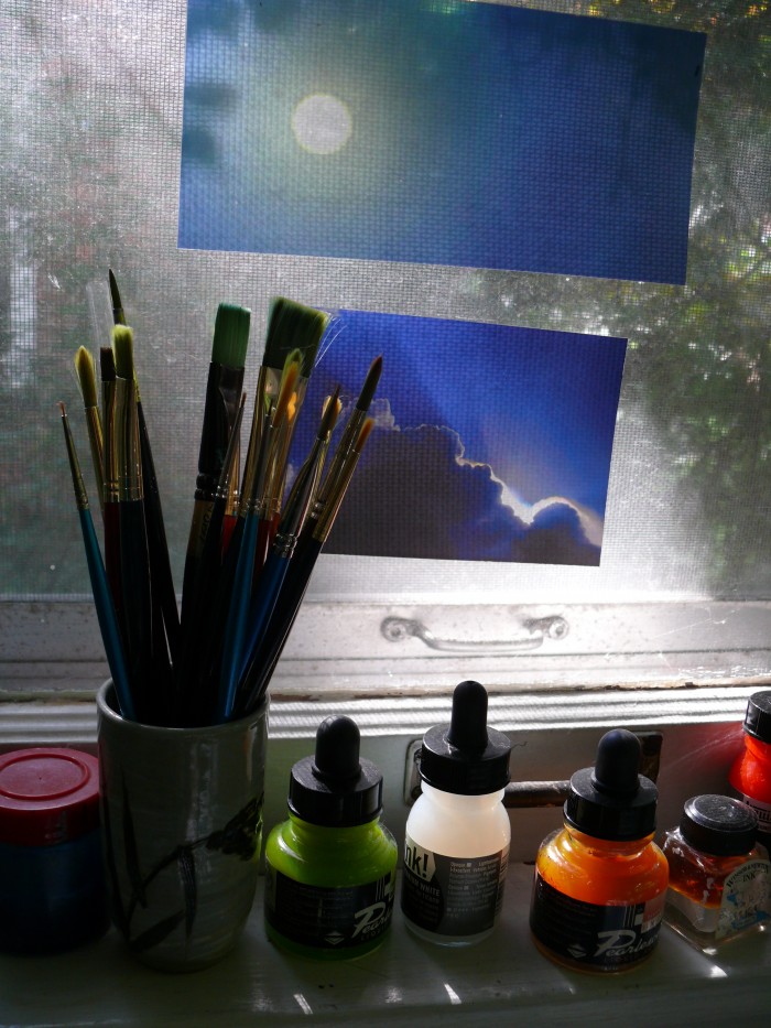
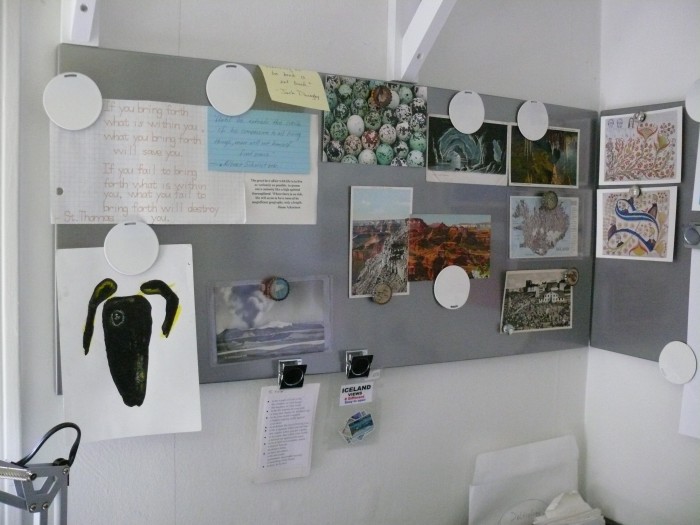
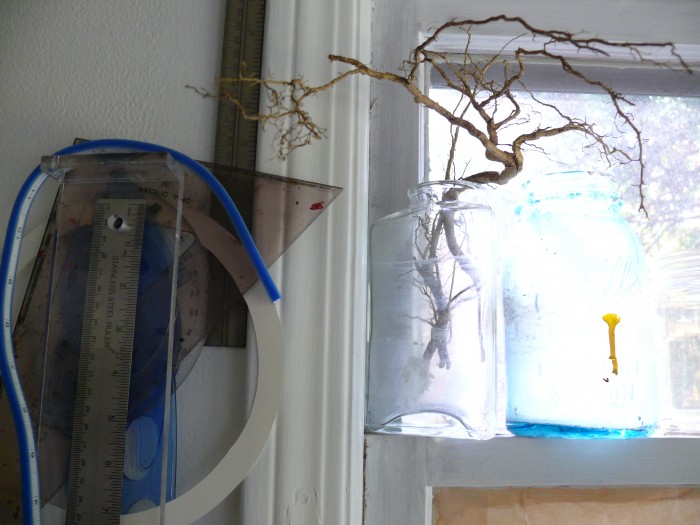
…and some detail shots:

Now to start making a mess again.

up-to-date

I updated my website, and that’s no mean feat, considering how behind I was.  Head on over there and check it out, won’t you?

Spring 2010 Collection at Gallery Project

Come on out to the opening on Friday if you can!  It should be a lot of fun!  Email or message me if you want a shirt to wear to the exhibition.  The info below is from Gallery Project’s website. Visit the site for hours and directions.  Hope to see you there!

spring2010

Spring 2010 Collection

December 9 to January 11

Opening Reception: Friday, December 11, from 6-9pm.

Gallery Project presents the Spring 2010 Collection, a fashion exhibit showcasing artists as designers and social commentators. The annual fundraising exhibit opens at noon on Wednesday, December 9 and runs to 4pm on Sunday, January 11.  The reception is on Friday, December 11, from 6-9pm.

The 27 local, regional and national artists have created their own collection line or individual pieces specifically for the exhibition, and have made work that will be modeled on the catwalk show during the opening reception.  Artists explore the myriad influences and contexts of fashion, investigating issues such as identity and values, innovation and retrogression, trends and fads, materialism and consumption, high and low fashion, globalism and regionalism, thrift, reusing, recycling and reclaiming.

Artists and art collectives include basement6 (Jon Humphrey and Robin Coe), Jillian Brown, Betsy Brunner, Dorota Coy, Steve Coy, Bianca DePietro, Melissa Dettloff, Reed Esslinger, Jennifer Locke, Lana McKinnon, Modati (Bilal Ghalib, Sarms Jabra, Alexander Lee), Ryan Molloy, Barbara Neri, Amy Sacksteder, Gary Setzer, Bethany Shorb, Alexander Sobolev, Brooks Harris Stevens, Jim Stevens, Britten Stringwell, Jenn Stucker, Talking Squid (Taryn Boyd), Scott Tallenger and Andrew Thompson.

The exhibit is designed as a fun, interactive event.  Visitors are encouraged to come out in their finery to join the debutants, fashionistas, and designers.  A Catwalk Show starting at 7pm will highlight the opening reception.  Paparazzi will be flashing their cameras, with images available for purchase.  Visitors will be able to purchase Photo Passes so that they can photograph themselves, as they model garments and participate in interactive work.  Gallery goers are also invited to make DIY projects throughout the exhibition.

This exhibition is curated by artists Jennifer Locke, assistant professor of art at Eastern Michigan University, Steve Coy, art lecturer at The University of Michigan School of Art and Design, and Alexander Lee, a founding member of Modati, a local silk screening company.

Gallery Project is a fine art collaborative.  Its mission is to provide a venue for contemporary art that is culturally aware, individualistic, courageous, and thought provoking.  Gallery Project is a 501(c)(3) nonprofit organization.  It is located at 215 South Fourth Avenue in Ann Arbor, Michigan.  Fall/Winter gallery hours: Tuesday through Thursday, noon-6; Friday and Saturday, noon-9; and Sunday, noon-4. The gallery is closed on Mondays.  For more information, please call 734-997-7012 or contact us through our website: www.thegalleryproject.com

showin’

It’s a busy, busy week of show preparation in the ol’ studio.  The work for the next Gallery Project exhibition is due Sunday.  Yikes!  Details coming soon to their website.

2010-pahpostcard

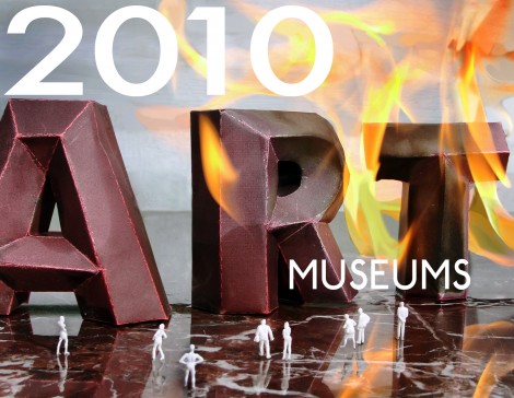
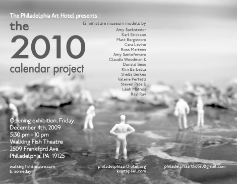
Also, if you happen to find yourself in the Philly area, you can attend the reception for the 2010 Calendar: MUSEUMS, Krista Peel’s latest venture that features a piece from yours truly.  The calendar would make a great Christmas gift.  Check it out.

2010-pahpostcardback

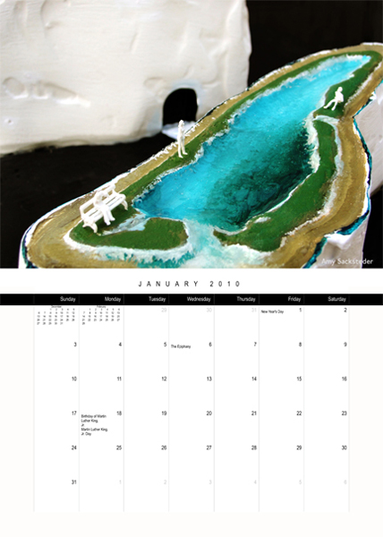
My calendar page.  Looks like I’m back to Ms. January!  I can’t believe I have been in these awesome calendars of KP’s since 2004!  What an honor!

I'm Ms. January once again!

of late

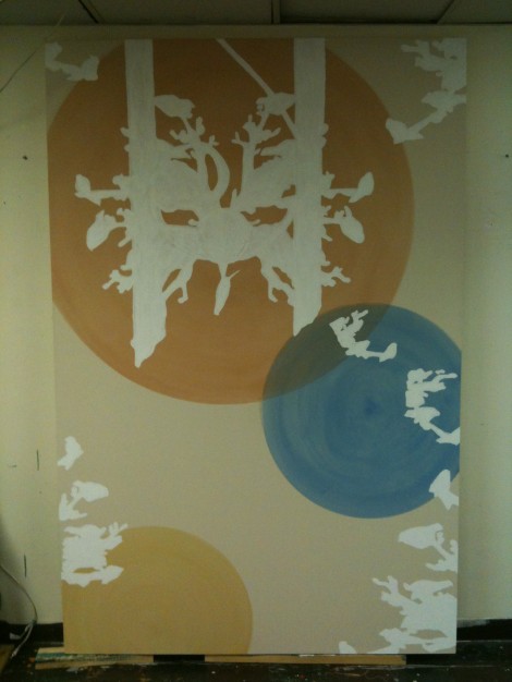
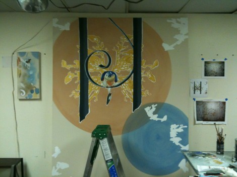
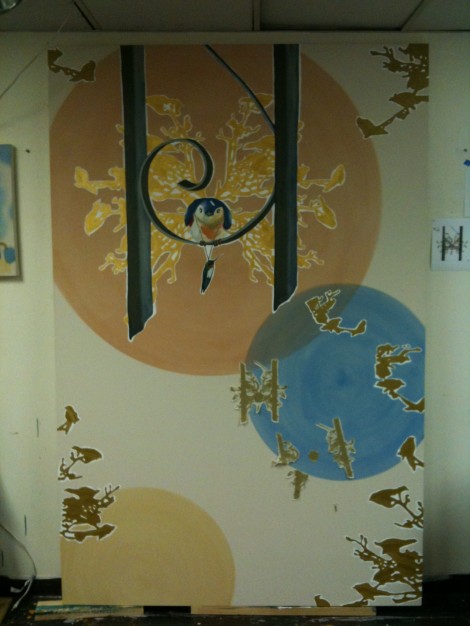
I have a show coming up at Gallery Project in Ann Arbor curated by three other artists, one of whom is my good friend and colleague at EMU, Jennifer Locke.  The show is called The Spring 2010 Collection (aka Fashion Show), and thus all of the work is about issues surrounding fashion, from a more cynical look at consumer culture, to a positive look at DIY and preloved movements.  The work in my series The Beautiful Ones, falls somewhere in between these two areas.  In 2007, I made a painting that had t-shirts that people could purchase and wear–something affordable to take away from the gallery-going experience–which was akin to being able to purchase band merch at a rock show.  In short, my painting could have groupies.  The goal was to allow people to be in a sort of performative dialog with the work.  The painting is “about” this sort of indie hipster culture, and also propagates it as well.  So, I had originally conceived of making two paintings and up until recently, just had the one.  This show was the perfect opportunity to realize the other.  They are both based on small drawings I did in France in 2007.  Below are some images of the piece in progress.  Progress continues.

circleage

gesso!

mandalage

where I'm at now

Here are two images of the t-shirt designs (printed by VGKids), one or both of which will be sewn into the surface of the painting.  They are printed on American Apparel Classic Girl and Standard American styles in the color natural and made from organic cotton.  I have sizes ranging from small to XL in both unisex and women’s shirts.  If you’re interested in a shirt, just email me with your size, style, and design preference.  They cost $15, but there’s a free shirt for anyone who is willing to come to the opening sporting the shirt and who stays for at least a half hour.  Let me know (by commenting on this post) if you want to participate, so that I can get you a shirt before the show.  I have already hired a bunch of my students, so it should be a lot of fun!
design 1

design 2

Here’s the info for the show.

What: The 2010 Collection (Fashion Show)

Where:  Gallery Project, 215 South Fourth Avenue, Ann Arbor, Michigan 48104

When: Opening Friday December 11, 2009, 6-9 p.m. Show runs from Dec 9 – Jan 11.

Gallery hours are:

Fall/Winter hours:

Tue -Thu, noon-6

Fri -Saturday, noon-9

Sun, noon to 4

because I can

If I’ve been remiss in blogging, it’s only because I’ve been blogging.  I’ve been helping Mark with Irreverent Vegan a lot lately.  There’s so much food-related stuff to do this time of year, what with putting the gardens to bed, buying up boatloads of tomatoes at the farmer’s market for canning, making pesto from end-of-season basil, etc.  Mark made swoon-worthy pesto and tomato pasta and baked green tomatoes last night.  Check out our action on that blog and let us know what you think.

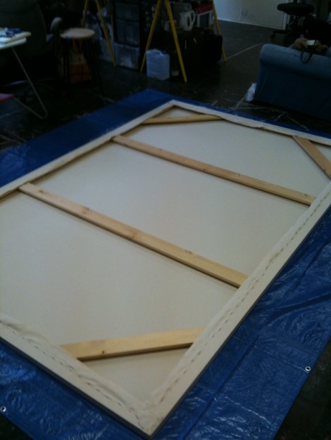
So, some stuff has been happening on the art front as well.  Mark and I stretched this monster last week:

a big 'un

Though sadly it was a rainy day when we stretched it and the humidity affected it.  It was tight as a drum when I left the studio last Thursday.  When I returned to the studio, it was as wrinkly and saggy as all get-out.  Great sadness ensued.  For me.  Then after about ten minutes of moping, (and since I have a painting due for a show in December) I got my stuff together and started painting on a different canvas.  I altered my Photoshop mock-up to be suited for a vertical rather than a horizontal format and shazam! I’m back in business.  This painting involves big circles, for which I fashioned a very high-tech compass out of a brooch, some string and a sponge brush.  Macgyver,  eat your heart out.

I also co-curated an exhibition at EMU called Contemporary Painting, which I’m really happy with.  More on that later.

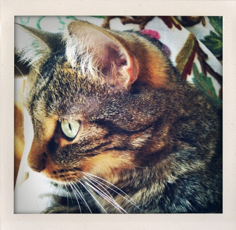
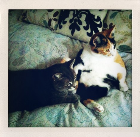
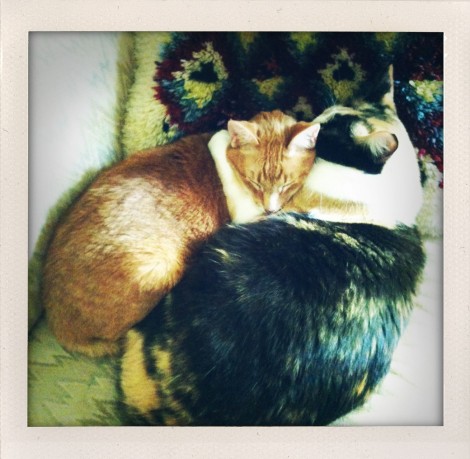
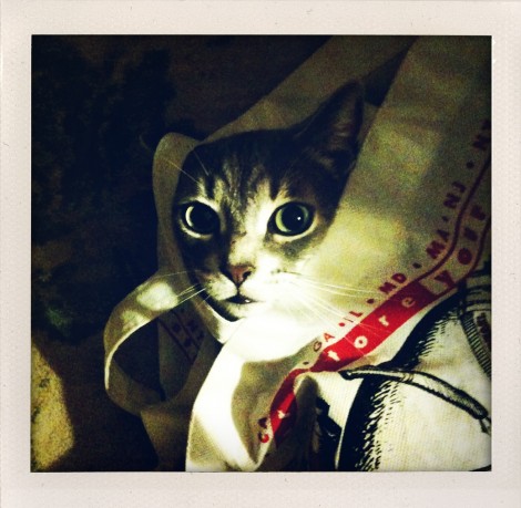
And, because our cats have been so dang photogenic lately, a bunch of cat photos.  Don’t say I didn’t warn you.

a handsome man

posers

kitty unity

cat in a bag

complements please

inspired

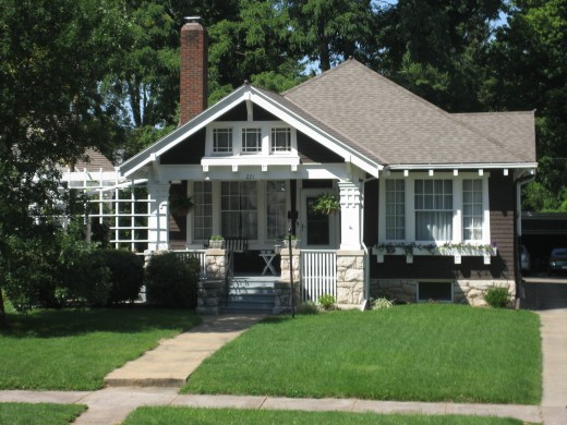
I haven’t been able to write in awhile because of all of the end-of-summer activity going on right now.  I wanted to post about my weekend trip to Quincy, Illinois.  Why yes, that is the famous site of the Lincoln/Douglas Debate.  Glad you mentioned it.  I went because I wanted to see two dear friends from grad school who are seldom in the same place when I have time to travel to them. This time the stars aligned to make it so, such that Thursday I found myself aboard my first ever U.S. passenger train headed toward Quincy via Chicago.  It was a wonderful weekend of art, friends, good food, catching up, and a  lot of laughter.  I stayed at the impeccable 1914 bungalow of friends Jen and Todd and got to hang out with their kiddos Trevor and Joel.

Jen and Todd's home

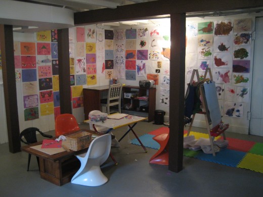
Of course I was inspired by the people I was with, but since I am always mesmerized by other peoples’ spaces (thus my infatuation with sites like The Selby, Apartment Therapy and magazines like Dwell), I thought I would post about it.  Jen and Todd (and even her parents) worked hard to make their basement into a space where Jen would want to have a studio and where the boys can play year-round.  They sealed the walls, cleaned up a lot and spray painted the heck out of the ceiling.  The result is a clean, crisp space with painted walls, floors, beams and trim that coordinates with the rest of the house.

Jen's studio with completed and in-progress paintings

Jen's studio with completed and in-progress paintings

Jen's latest painting

Jen's latest painting

To see more images of her work, visit her website.

The boys' "studio"- I love the colorful art lining the walls!

The boys' "studio"- I love the colorful art lining the walls!

The occasion for my visit was our friend Kelly‘s exhibition at the college where Jen teaches and runs the gallery.  I got there too late to attend the opening, but did get there in time to: attend (even help out with)  Kelly’s mural painting workshop, go to the farmer’s market, do some thrifting ($25 pair of Lane end tables- score!), enjoy several delicious meals, play soccer with a pair of squirts, partake in raspberry AND lemon sorbet at a sci-fi/horror themed ice cream parlor (Eye-Scream anyone?).

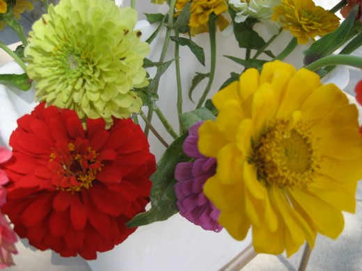
farmer's market flowers

farmer's market flowers

Indian corn

Indian corn

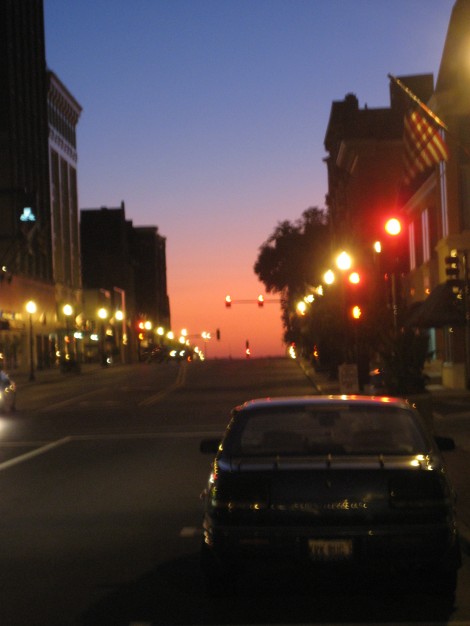
Saturday night we were awestruck by a breathtaking sunset.

sunset in the Q

sunset in the Q

Here’s my attempt at one of the photos that inspires Jen’s paintings:

sunset bridge

Even with 18 hours on a train, it was a very complete and restoring weekend.

crystalskullmirrors

I have been noticing a lot of crystals, skulls and mirrors in art and design in the last few years.  It appears to be a “thing.”  I readily embrace this “thing” and have even busted out a skull or three in my recent work.  There’s a very The Dark Crystal / The Never Ending Story aesthetic to a lot of this work which can probably be explained by the fact that many of the artists embracing it are of the generation that likely grew up with those movies and other like films, books, programs (media in general)  ingrained into our consciousness.

While some incidents of crystalskullmirror I’m seeing are mediocre (one can apparently make abominably cliché work with mirrors, for example) I find myself gravitating toward a lot of this work.  If this post makes it seem like I am lumping artists using these motifs into the same aesthetic category, then please take a look at some of my favorite folks in this realm and judge for yourself.

I am a huge fan of the work of Will Yackulic.  He shows with two galleries I really like: Jeff Bailey in New York and Gregory Lind in San Francisco.  He uses ink and gouache (two media I like to work with) and, somehow, a typewriter to make these stunning two-dimensional otherworlds.

Bearings & Ballast, 2009, ink, gouache and typewriter on paper, 30 x 22.25

Bearings & Ballast, 2009, ink, gouache and typewriter on paper, 30" x 22.25"

Aspects & Allowances, 2008 ink, gouache, watercolor and typewriter on paper, 22 x 17.75 inches

Aspects & Allowances, 2008 ink, gouache, watercolor and typewriter on paper, 22 x 17.75 inches

Invocation 5th, 2008, gouache, watercolor and typewriter on paper, 10.625 x 8.5

Invocation 5th, 2008, gouache, watercolor and typewriter on paper, 10.625" x 8.5"

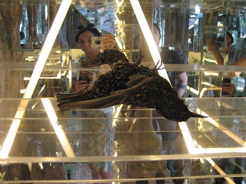
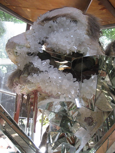
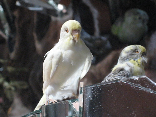
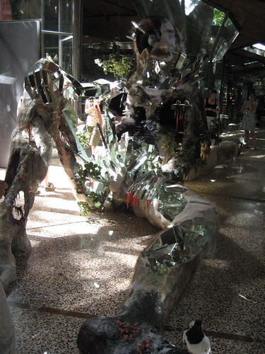
Then there’s the work of David Altmejd, whose work Mark and I first came across in the 2007 Venice Biennale, where he put together a fantastic, nay, phenomenal exhibition for the Canadian pavilion.  He uses mirrors A  LOT, but SO much better than anyone else out there using mirrors to do similar things.  They are just one aspect of the insane worlds he creates, which also include:  taxidermied birds,*  giants, genitals, both flora and fauna, fur, body parts, and YOU because there are so many mirrors in his work, that you inevitably become part of the work.  I could barely photograph it without getting myself in a shot.  Like this:

The Index, exhibition at the Canadian pavilion

The Index, exhibition at the Canadian pavilion

Note please that I am not a professional photographer and that there are way sweeter images of his work online.  See? But I thought it would be neat to post some photos I took while experiencing the exhibition.

The Index, exhibition at the Canadian pavilion

The Index, exhibition at the Canadian pavilion

a mirrored giant monster with Lee Press-On Nails (TM)

a mirrored giant monster with Lee Press-On Nails (TM)

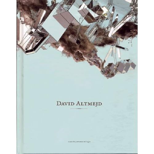
We like him so much, in fact, that we just ordered two monographs on him.  One is the catalog for this exhibition, and the other is this lovely book:

For example of this crystal mirror phenomenon in contemporary media, someone caught indie pop lady Mirah fiddling with these mirror pyramids and put the photo in the liner notes of her latest album.

a(spera)

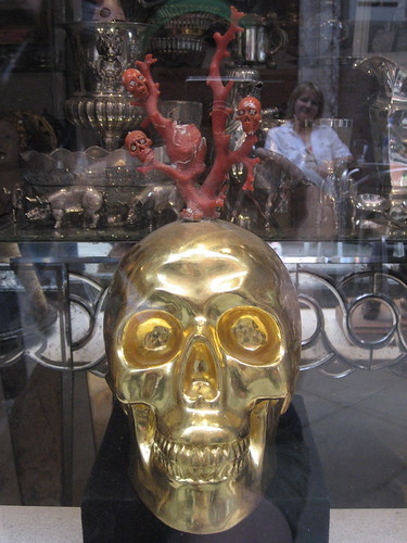
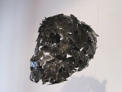
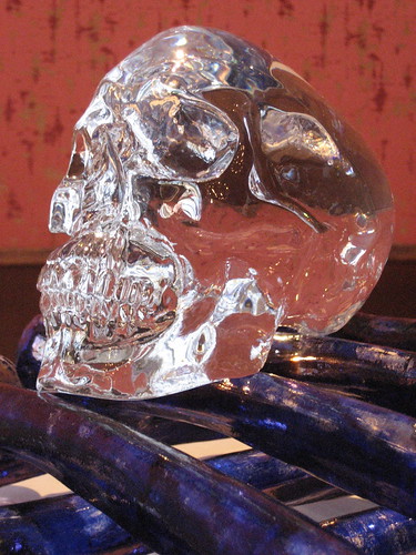
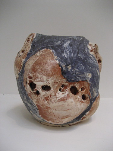
Skulls.  Lots of skulls.  When in Europe, whenever I saw a skull in contemporary art, I photographed it.  Here are the results of my self-assigned scavenger hunt:

skull in a gallery window in Venice (as a bonus, it even has a skull tree growing from it)

skull in a gallery window in Venice (as a bonus, it even has a skull tree growing from it)

butterfly skull in a gallery in Venice

butterfly skull in a gallery in Venice

glass skull on glass bones by Jan Fabre at the exhibition Glasstress in Venice

glass skull on glass bones by Jan Fabre at the exhibition Glasstress in Venice

ceramic vessel by Miquel Barceló, representing the Venice pavilion at the Biennale

ceramic vessel by Miquel Barceló, representing the Spanish pavilion at the Biennale

skull in a drawing by Jef Geys, representing the Belgian pavilion

skull in a drawing by Jef Geys, representing the Belgian pavilion

And now, my own contribution:

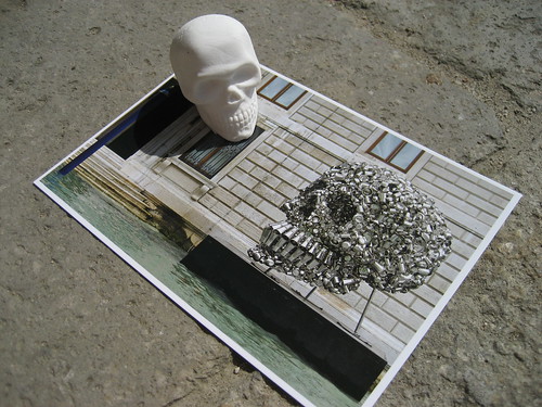
still life I composed out of a postcard and an eraser from the Pinault Collection gift shop

still life I composed out of a postcard and an eraser from the Pinault Collection gift shop

I am so enamored of people’s fascination with skulls (just go on The Selby and see how many skulls you can count in people’s homes alone), that I was making portraits of skulls in Budapest, remember? I’ll get back to those soon I think.

That reminds me, I need to get amakin’, as I am yet again a contributing artist to my friend Krista Peel‘s Calendar Project.  This time the theme is Art Museum, for which I have to create a mini model of a museum.  It can be ANYTHING I want it to be, can be made of any material, and, (blessedly) does not have to be in the least functional.  So, which will it be: Crystals, Skulls, or Mirrors?  I suppose we’ll see…

* Taxidermy is another “thing” in art right now altogether.  Perhaps I’ll tackle that stuffed, lifeless beast in a future post.

guested

I was fortunate to guest blog about none other than… rings (of course!) on my friend Lauren’s blog Dear Golden.  She also has a top notch etsy shop by the same name through which she proffers vintage wares, and I am guilty of taking home a lot of the bounty.  I suppose I could have composed the same post for this blog, but I haven’t really written about fashion much here, and since her blog is geared toward it, specifically vintage fashion from all eras, we thought the guest blog would be a fun idea.

Lauren and I like a lot of the same kinds of vintage clothing, though her scope is much larger than mine.  Her tastes never fail to inspire me.

We have been thrifting buddies for awhile now.  I think the reason I like thifting so much is getting so much for so little.  Thifting allows one to find seemingly unique items, often in very good or excellent condition, for a low price.  I really like purchasing previously owned pieces that have a history, and in doing so, I am not encouraging the manufacture of new goods, or so I tell myself.  I know I am not alone in this practice (which, if you’re not careful can border on obsession).  And it’s not just clothing that I find in this way, but also house stuff.  We have a thoroughly thrifted house.  What isn’t thrifted is often from craigslist, garage sales, or antique stores.

Of course, buying from Dear Golden means that I am buying thrifted items, but it’s even better because I am getting hand-selected, often carefully mended clothing, about which Lauren knows the historical context.  And I’m supporting a friend too.  I model for her from time-to-time and am happy when she sends me home with “payment” in an especially cool skirt I modeled that day, or a pair of shoes.